Color without glare has always been a kind of quiet dream for people who work with information every day. Graphic designers moving between sketches, researchers comparing charts, architects mapping layers of detail, policy experts marking sensitive passages, and students building structured notes all know how quickly bright screens can drain attention. A tablet that reduces fatigue while keeping color present enough to guide thinking feels almost contradictory. Yet this contradiction is exactly where new color E-Ink devices prove their value.
Why Color E-Ink Matters for Focused Work”
Professionals often underestimate how much light affects both concentration and judgment. Bright backlit displays bring energy at first, but long sessions of drafting, reviewing, or annotating eventually lead to the same tired eyes and scattered focus. The shift toward color E-Ink is not just about novelty. It reflects a growing need to work with documents in a way that respects the natural pace of the mind. The BOOX Note Air 4 C enters this picture as a device that treats color not as a spectacle, but as an anchor for structure, clarity, and gentle emphasis.
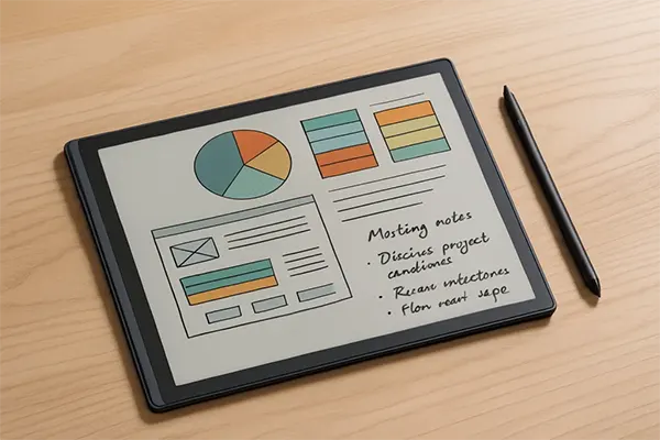
The first thing many people notice when using a color E-Ink screen is how calmly the surface behaves. It does not shout. It guides. Soft reds, muted blues, and subtle greens help separate layers of information without overwhelming the eyes. This controlled palette offers enough variation for designers who like mapping early mockups or highlighting visual hierarchies. It also gives researchers and analysts the ability to use color coding for categorization without the overstimulation typical of LCD or OLED panels.
How Controlled Color Supports Reading, Writing, and Analysis
Writers, policy drafters, and legal professionals benefit from this balance too. When reading for long stretches, the absence of glare and the paper-like character of E-Ink restore the kind of immersion usually found in printed documents. At the same time, color highlights allow them to track arguments, structure paragraphs, and sort reference notes without switching between devices. This combination of paper logic and digital precision is one of the reasons color E-Ink is gaining attention among people who spend their days working with dense material.
The format of the BOOX Note Air 4 C plays a part in this shift as well. A slim body and a balanced layout encourage natural writing posture. The pen glides on the surface with a resistance that feels close to real paper, giving designers a stable environment for quick diagramming. Students and academics can annotate articles, write formulas, or revise drafts without the kind of distortion caused by bright light displays. Color is present, but it never competes with the text.
Design and Comfort: What the Note Air 4 C Gets Right
There is also something reassuring about using a device that does not push the mind into multitasking chaos. The experience focuses on the content itself, not the surrounding distractions. Those who work with decision-heavy material appreciate how a controlled color palette sharpens attention. People reviewing architectural plans will see layers more clearly. Students preparing visual summaries will find it easier to keep track of categories. Analysts working with risk or compliance documents will notice how subtle color cues help them reorganize information faster.
Why a Calmer Digital Experience Improves Decision-Heavy Work
Midway through this conversation about clarity and controlled color, it becomes clear why Einktab has become part of the broader choice ecosystem. By curating devices that match the needs of focused workers, it opens a space where tools are selected not for flashiness but for functional depth. It’s a reminder that technology gains value when it respects human attention, not when it tries to dominate it.
Color E-Ink is also finding a place in sketching and conceptual design. Early visual thinking does not require glossy saturation. It requires structure, proportion, and a palette that does not rush decisions. Designers using the Note Air line often comment on how color serves as a guide rather than a distraction. Blocks of muted tones help establish rhythm and order before moving to high-fidelity rendering elsewhere. The mental pace slows down just enough for ideas to mature instead of scatter.
Academic work benefits in similar ways. Students who spend hours reading research papers can navigate diagrams and graphs more comfortably. Highlights remain visible without the brightness typical of other screens. The ability to switch between textbooks, handwritten notes, and lightly colored diagrams creates an environment where learning feels more grounded and less stressful. In a time when digital education is often overloaded with visual noise, the controlled color of E-Ink becomes a quiet advantage.
A Better Way to Sketch, Study, and Think Deeply
Color without excess light is not a slogan. It reflects a genuine shift in how people want to interact with information. It supports deeper reading, steadier writing, and clearer decision-making. When long hours are part of the routine, the comfort of a paper-like surface mixed with thoughtful use of color becomes more than a preference. It becomes a working standard.
The rise of devices like the Note Air 4 C signals a change in how digital tools are being evaluated. People are no longer impressed by brightness alone. They look for calmness, focus, and tactile authenticity. They want technology that respects their energy rather than draining it. Color E-Ink fits this expectation with surprising precision.
As work becomes increasingly dependent on fast information processing, devices that protect attention will keep gaining value. A balanced screen, a thoughtful color range, and an environment that encourages deep engagement rather than rapid switching create an experience that feels purposeful. That is why the modern color E-Ink tablet, used wisely, is becoming an essential tool for those who shape, analyze, and refine information every day.